02 / Jewellery
Prismatic dream.
SwarovskiIdyllia
Prismatic light, architectural silhouettes and detailed product photography form one expressive world around the Idyllia necklace.
Connect an expressive campaign world with clear product discovery across social, email and a dedicated landing page.
Style-led jewellery shoppers seeking a distinctive piece with a personal point of view.
A prism creates multiple expressions of light. The necklace becomes the constant that connects each image and touchpoint.
ONE STORY.
EVERY FORMAT.
Stories and static Reels covers, shown as individual creatives.
Hover to explore; click for a closer look.
THE NEXT
TOUCHPOINT.
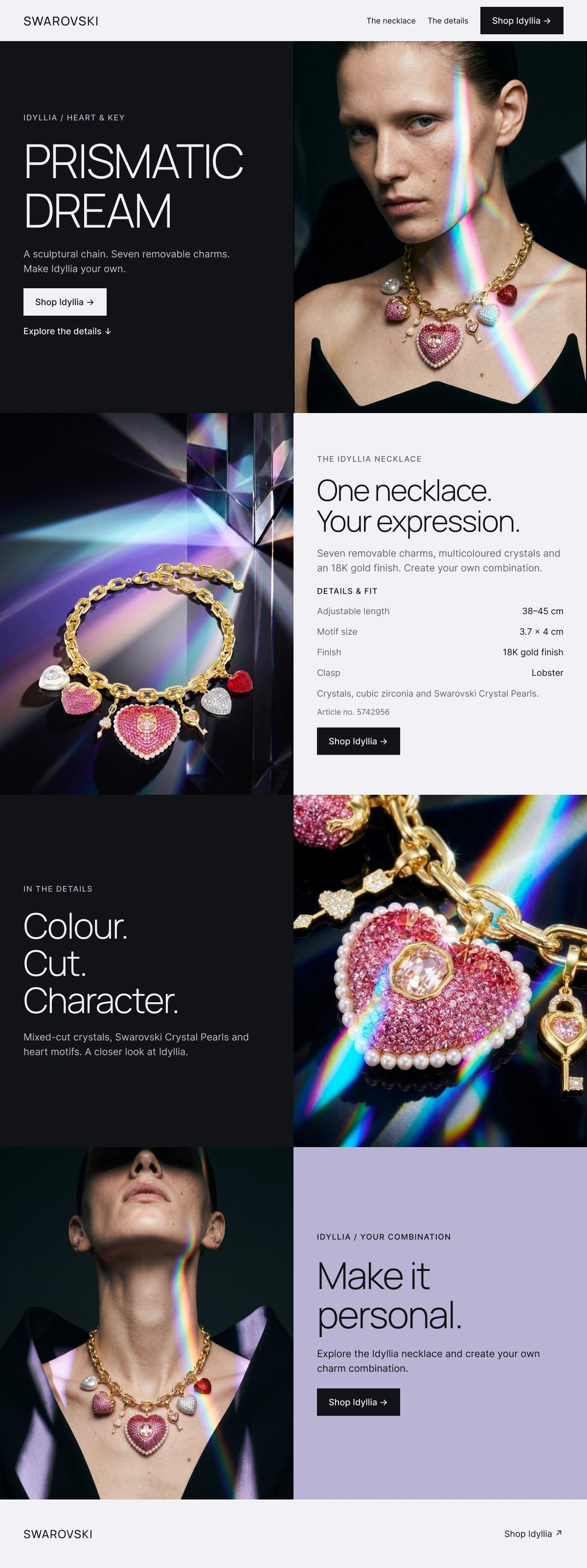
A dedicated campaign landing page.
Desktop composition and a considered mobile layout.

THE CAMPAIGN,
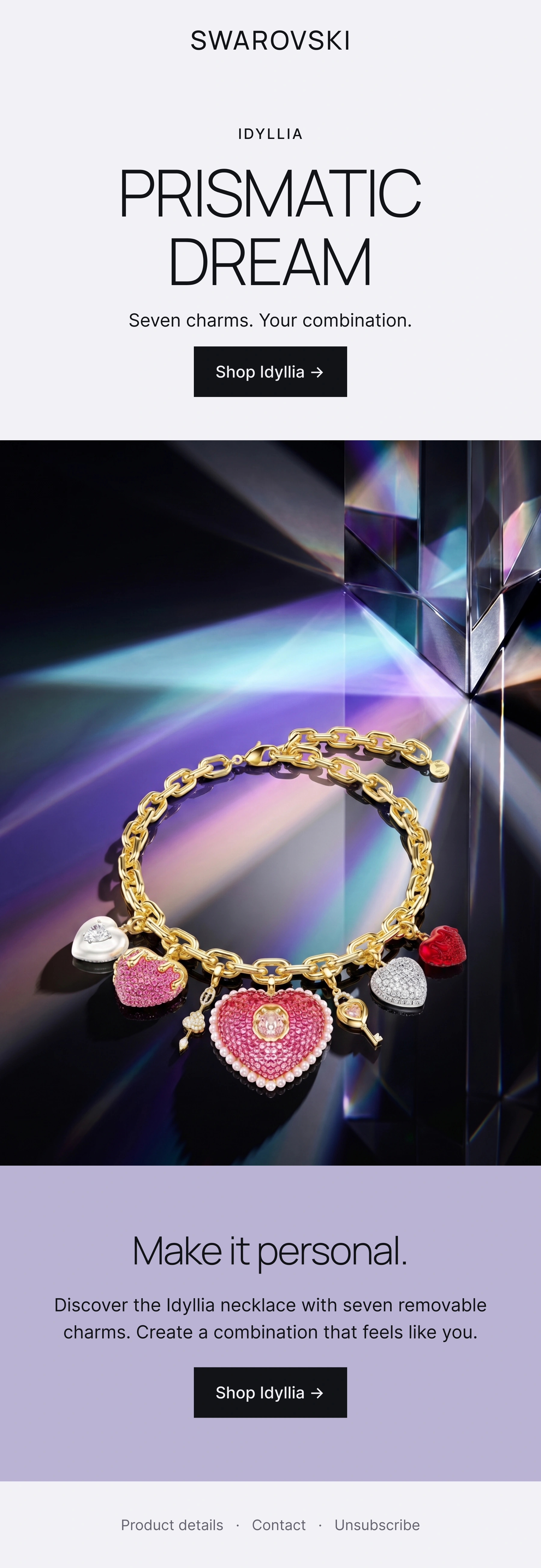
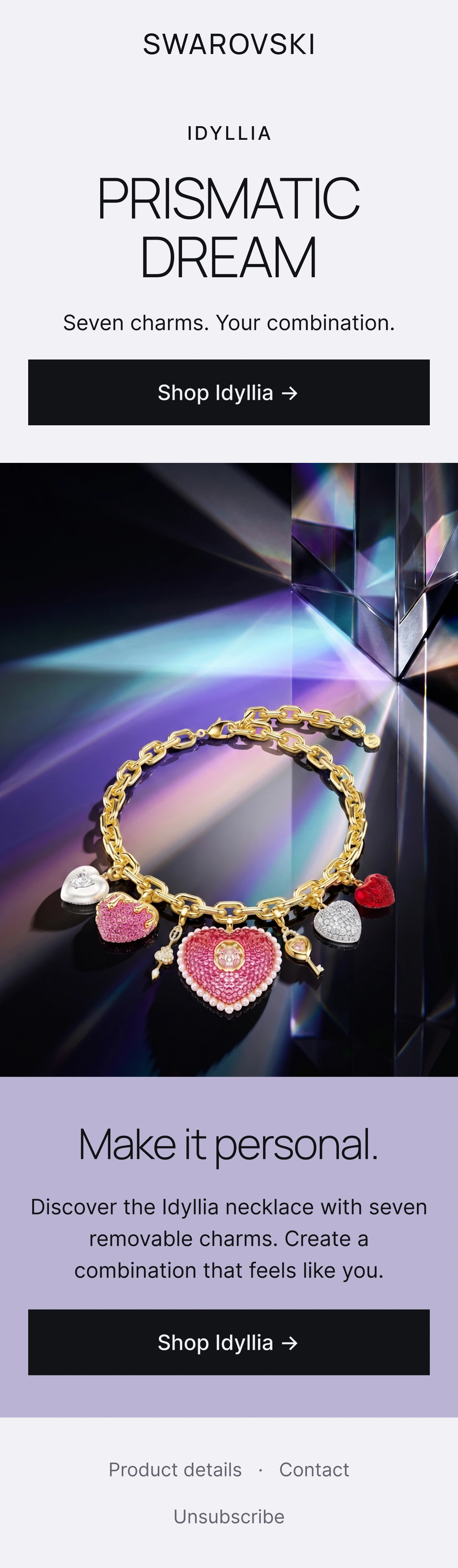
IN THE INBOX.
One clear product story and a consistent action.
Designed for desktop and mobile reading.
AN IDEA
AT A GLANCE.
A single visual, a clear headline and a recognisable product. The campaign translated for an awareness placement.
DESIGN
DECISIONS.
Visual language
Prismatic light and spectral colour. An architectural muse and sculptural styling. Complete product views alternate with on-model images and crystal close-ups.
Product consistency
Keep the original necklace and motif shape. Preserve product proportions in every shot. Balance experimental light with clear detail.
Composition
Open, asymmetric layouts and light type. Close-ups make crystal detail legible; each channel offers a clear route to the product.
CAMPAIGN PALETTE
- PEARL
#F2F1F5 - LAVENDER
#BBB3D4 - PINK
#CB4B87 - INK
#111216
CAMPAIGN TYPOGRAPHY
Manrope Light / Inter
PRISMATIC DREAM
WHAT I’D TEST.
Compare personal-expression-led copy with crystal-detail-led copy. Hold the audience and offer consistent; measure landing-to-product clicks and purchases when tracking is available.
Say it in red.